Touchpoint components
Getting started
Touchpoint components work together with each other to create rich chat experiences.
Building Custom Components
Modalities
Touchpoint relies on modalities defined within the NLX application to send structured data from the NLX conversation flow to touchpoint. For each Modality defined in your conversational application that you wish to use with Touchpoint, you must create a component and explicitly enable that modality when creating your touchpoint instance.
Defining your Component
Each component should accept an object with data and conversationHandler to access the conversation context sent from the NLX Application.
data: Can be any type. It will match the schema set in the modality within NLX.conversationHandler: The ConversationHandler. Functions to access the conversational context and send data back to NLX.
Add the Component to the customModalities configuration option paired with the name of Modality in NLX. In the example below the modality is named "MyComponentModality".
Basic Component Structure
1/**
2 * @param {Object} props - The properties object.
3 * @param {Object} props.data - The data object - Defined in NLX as a modality and set within the Node
4 * @param {Function} props.conversationHandler - The ConversationHandler
5 *
6 * @returns {JSX.Element} The rendered component.
7 */
8const Component = ({data, conversationHandler}) => {
9  const myComponent = ();
10  return myComponent;
11}
12
13const touchpointOptions = {
14  config: {
15    applicationUrl: "YOUR_APPLICATION_URL",
16    headers: {
17      "nlx-api-key": "YOUR_API_KEY"
18    },
19    languageCode: "en-US"
20  },
21  theme: {"fontFamily":"\"Neue Haas Grotesk\", sans-serif","accent":"#2663DA"},
22  customModalities: {
23    "MyComponentModality": Component,
24  }
25};
26
27// Register components with specific modality keys
28const touchpoint = await create(touchpointOptions);
Example Button Modality
Create a modality named TextButtonExample within NLX and attach to a User Choice Node. Then custom slots or a static data request to set any value for buttonLabel and buttonId for this example.
1{
2  "buttonLabel": "Label to be displayed on the button",
3  "buttonId": "Id of the 'choice' to send back to NLX"
4}
Example Button Component
1import { create, TextButton } from "@nlxai/touchpoint-ui";
2/**
3 * MyFirstButtonComponent is a functional component that renders a TextButton with a label, icon, and click handler.
4 *
5 * @param {Object} props - The properties object.
6 * @param {Object} props.data - The data object - Defined in NLX as a modality and set within the Node
7 * @param {string} props.data.buttonLabel - Label to be displayed on the button
8 * @param {string} props.data.buttonId - Id of the 'choice' to send back to NLX.
9 * @param {Function} props.conversationHandler - The handler object that contains the function sendChoice to be called on button click
10 *
11 * @returns {JSX.Element} The rendered TextButton component.
12 */
13const MyFirstButtonComponent = ({ data, conversationHandler }) => {
14  const myTextButton = (
15    <TextButton
16      label={data.buttonLabel}
17      Icon={Icons.ArrowForward}
18      onClick={() => conversationHandler.sendChoice(data.buttonId)}
19    />
20  );
21  return myTextButton;
22};
23
24const touchpointOptions = {
25  config: {
26    applicationUrl: "YOUR_APPLICATION_URL",
27    headers: {
28      "nlx-api-key": "YOUR_API_KEY",
29    },
30    languageCode: "en-US",
31  },
32  theme: { fontFamily: '"Neue Haas Grotesk", sans-serif', accent: "#2663DA" },
33  customModalities: {
34    TextButtonExample: MyFirstButtonComponent,
35  },
36};
37
38// Register components with specific modality keys
39const touchpoint = await create(touchpointOptions);
Example CustomCard Modality
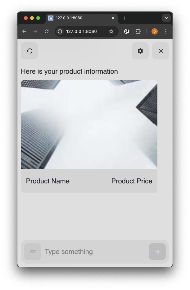
For example, a Modality named "ProductCard" with schema:
1{
2  "name": "Product Name",
3  "id": "Product UUID",
4  "price": "Product Price",
5  "productImageUrl": "Product Image URL"
6}
Example CustomCard Component
1import {
2  create,
3  CustomCard,
4  BaseText,
5  TextButton,
6  SmallText,
7} from "@nlxai/touchpoint-ui";
8
9/**
10 * ProductCardComponent is a React functional component that renders a custom card for a product.
11 *
12 * @param {Object} props - The properties object.
13 * @param {Object} props.data - The data object containing product details.
14 * @param {string} props.data.id - The unique identifier for the product.
15 * @param {string} props.data.productImageUrl - The URL of the product image.
16 * @param {string} props.data.name - The name of the product.
17 * @param {string} props.data.price - The price of the product.
18 * @param {Function} props.conversationHandler - The handler object with a sendChoice method.
19 *
20 * @returns {JSX.Element} A custom card component displaying product details.
21 */
22const ProductCardComponent = ({ data, conversationHandler }) => {
23  const [selected, setSelected] = React.useState(null);
24  return (
25    <CustomCard
26      key="0"
27      selected={selected === 0}
28      onClick={() => {
29        setSelected(0);
30        conversationHandler.sendChoice(data.id);
31      }}
32    >
33      <CustomCardImageRow src={data.productImageUrl} alt={data.name} />
34      <CustomCardRow
35        left={<BaseText>{data.name}</BaseText>}
36        right={<BaseText>{data.price}</BaseText>}
37      />
38    </CustomCard>
39  );
40};
41
42const touchpointOptions = {
43  config: {
44    applicationUrl: "YOUR_APPLICATION_URL",
45    headers: {
46      "nlx-api-key": "YOUR_API_KEY",
47    },
48    languageCode: "en-US",
49  },
50  theme: { fontFamily: '"Neue Haas Grotesk", sans-serif', accent: "#2663DA" },
51  customModalities: {
52    ProductCard: ProductCardComponent,
53  },
54};
55
56// Register components with specific modality keys
57const touchpoint = await create(touchpointOptions);
Building HTML Components without Transpiling
Touchpoint provides a way to create components without requiring a build step or JSX transpilation through the html template literal tag. Touchpoint uses the htm library to enable the html functionality.
This is useful when:
- Creating Components in
<Script>tags - Creating Components in an existing JS codebase (no JSX)
- Adding Touchpoint to a project without a existing build system
Import and Basic Usage
- Access the
htmltag function directly from the Touchpoint object - When nesting components, wrap them in
${html...}syntax - Use
${array.map(...)}for rendering arrays of components - Template strings must maintain proper nesting and structure
1const { html, BaseText } = nlxai.touchpointUi;
2
3// Use html to create components with template literals
4const myComponent = ({ data, conversationHandler }) => {
5  // Basic syntax
6  return html` <BaseText>Hello</BaseText> `;
7};
Example: Creating a Carousel with CustomCards
Refactor the example Carousel from the CustomCards Documentation.
1<script src="https://unpkg.com/@nlxai/touchpoint-ui/lib/index.umd.js"></script> 2<script> 3 const { html, React } = nlxai.touchpointUi; 4 const CarouselExample = ({ data, conversationHandler }) => { 5 const [selected, setSelected] = React.useState(null); 6 return html`24`; 25 }; 26</script>
Component Categories
Touchpoint provides different types of components that work together:
- Typography - Text components to create consistent text presentation:
- Carousel & CustomCards - Structure your content with Card collections
- Buttons - Handle user actions with text or icon based buttons
- Icons - Add graphical elements with consistent iconography