Custom Components
Buttons
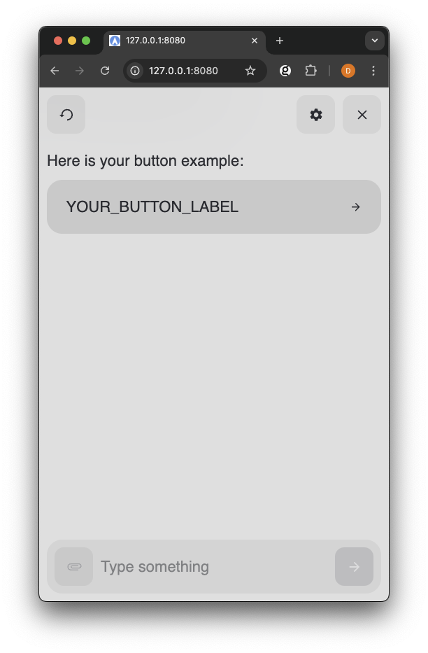
Text Button Example
About
Touchpoint provides two types of button components for handling user interactions: TextButton and IconButton. These components offer consistent styling and behavior while serving different interaction needs.
- TextButton - Text-based interactive element with optional icon support. It's ideal for primary actions and menu items.
- IconButton - Icon-only interactive element. It's ideal for compact actions and toolbars.
Properties
Both TextButton and IconButton have required properties to render the elements correctly in the conversations flow.
TextButton Properties
| Property | Type | Required | Description |
|---|---|---|---|
| label | string | Yes | Button text |
| Icon | Icon | Yes | Icon component |
| onClick | function | No | Click handler |
| type |
| No | Button style variant |
IconButton Properties
| Property | Type | Required | Description |
|---|---|---|---|
| Icon | Icon | Yes | Icon component to render |
| label | string | Yes | Accessible label (for screen readers) |
| type |
| Yes | Button style variant |
| onClick | function | No | Click handler |
Import and Basic Usage
You can import the buttons elements from touchpoint once the package has been installed or made available in your project.
Define onClick
The Button Component expect a function passed via
onClick to define the actions to take when a user clicks the button.
Access the ConversationHandler method
sendChoice via conversationHandler.sendChoice to send the user's choice back to NLX.
Read more details about building Custom Components with Touchpoint in the Getting started with Touchpoint components documentation page.
Example
The examples below require a modality defined in your NLX application as an object with at least
buttonLabel and buttonId properties.
Example Modality Schema
1{
2  "buttonLabel": "Label passed to button Component",
3  "buttonId": "Id of the 'choice' to send back to NLX"
4}
Example Button Components
1<html lang="en"> 2 <head> 3 <title>Touchpoint Sample HTML</title> 4 <meta name="viewport" content="width=device-width, initial-scale=1"> 5 </head> 6 <body> 7 <script type="module"> 8 import { create, React, html } from "https://unpkg.com/@nlxai/touchpoint-ui@1.2.4-alpha.9/lib/index.js?module"; 9 10 const TextButtonExample = ({ data, conversationHandler }) => { 11 return html`17`; 18 }; 19 20 const IconButtonExample = ({ data, conversationHandler }) => { 21 return html`28`; 29 }; 30 31 // Register components when creating touchpoint 32 const touchpoint = await create({ 33 config: { 34 applicationUrl: "YOUR_APPLICATION_URL", 35 headers: { "nlx-api-key": "YOUR_API_KEY" }, 36 languageCode: "en-US", 37 }, 38 modalityComponents: { 39 TextButtonModality: TextButtonExample, 40 IconButtonModality: IconButtonExample, 41 }, 42 }); 43 44 </script> 45 </body> 46</html>
Related Documents
- Icons for list of Icons available in Touchpoint
- Theming Touchpoint