Touchpoint Setup
Chat Modes
Touchpoint UI offers two distinct chat input modes ('Assistant Style' and 'Classic Chat Style') each designed for different use cases and user experiences.
Chat Modes
- Assistant Style
- Focused interface highlighting current interaction with clean minimal interface to focus user attention and reduced distractions.
- Classic Chat Style
- Traditional messaging interface with full history visible, easy message reference, familiar chat experience.
Visual Comparison Details
| Feature | Assistant Style | Classic Chat Style |
|---|---|---|
| Message History | Hidden by default, scrollable | Always visible |
| Focus | Current interaction only | Full conversation |
| Loading Indicator | Full-screen overlay | Inline with messages |
| Screen Space | Maximizes content area | Fixed message list |
| User Experience | Step-by-step guidance | Conversational flow |
When to Use Assistant Style
- Guided workflows: Step-by-step processes like form filling or troubleshooting
- Simple queries: Quick questions that don't require conversation history
- Mobile experiences: Limited screen space benefits from focused interface
- Task completion: When users need to focus on one thing at a time
When to Use Classic Chat Style
- Support conversations: When users need to reference previous messages
- Complex discussions: Multi-turn conversations with context dependencies
- Documentation queries: When users might need to scroll back for information
- Familiar experience: When users expect traditional chat interfaces

Configuration Quick Reference
| Property | Type | Default | Description |
|---|---|---|---|
chatMode | boolean | false | false = Assistant style, true = Classic chat |
userMessageBubble | boolean | false | Add bubble styling to user messages |
agentMessageBubble | boolean | false | Add bubble styling to agent messages |
Note: Message bubble settings work with both chat modes but have different visual effects in each mode.
Assistant Style (Default)
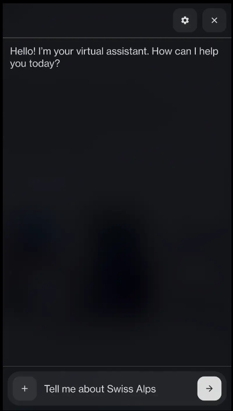
The Assistant Style provides a focused experience where only the latest application message is prominently displayed. This creates a clean interface that directs the user's attention to the most recent information or question, while still allowing them to scroll up to view conversation history.
Example Assistant Configuration
To implement the default Assistant Style, you can either omit the
chatMode parameter or explicitly set it to false:
1<html lang="en"> 2 <head> 3 <title>Touchpoint Sample HTML</title> 4 <meta name="viewport" content="width=device-width, initial-scale=1"> 5 </head> 6 <body> 7 <script type="module"> 8 import { create, React, html } from "https://unpkg.com/@nlxai/touchpoint-ui@1.2.4-alpha.9/lib/index.js?module"; 9 10 const touchpointOptions = { 11 config: { 12 applicationUrl: "YOUR_APPLICATION_URL", 13 headers: { 14 "nlx-api-key": "YOUR_API_KEY", 15 }, 16 languageCode: "en-US", 17 }, 18 chatMode: false, // Explicitly set to false or omit (default is false) 19 // Add other common options like theme, brandIcon etc. if needed 20 theme: { 21 fontFamily: '"Neue Haas Grotesk", sans-serif', 22 accent: "#AECAFF", 23 }, 24 }; 25 26 const touchpoint = await create(touchpointOptions); 27 28 </script> 29 </body> 30</html>
Example Assistant Configuration with message bubbles
To add message bubbles to the Assistant Style:
1<html lang="en"> 2 <head> 3 <title>Touchpoint Sample HTML</title> 4 <meta name="viewport" content="width=device-width, initial-scale=1"> 5 </head> 6 <body> 7 <script type="module"> 8 import { create, React, html } from "https://unpkg.com/@nlxai/touchpoint-ui@1.2.4-alpha.9/lib/index.js?module"; 9 10 const touchpointOptions = { 11 config: { 12 applicationUrl: "YOUR_APPLICATION_URL", 13 headers: { 14 "nlx-api-key": "YOUR_API_KEY", 15 }, 16 languageCode: "en-US", 17 }, 18 chatMode: false, // Assistant style 19 userMessageBubble: true, // Display user messages in bubbles 20 agentMessageBubble: true, // Display agent messages in bubbles 21 theme: { 22 fontFamily: '"Neue Haas Grotesk", sans-serif', 23 accent: "#AECAFF", 24 }, 25 }; 26 27 const touchpoint = await create(touchpointOptions); 28 29 </script> 30 </body> 31</html>
Classic Chat Style
The Classic Chat Style provides a traditional messaging interface where all messages stack chronologically and remain visible. This creates a more conventional chat experience that many users are already familiar with from messaging apps.
Example Classic Chat Configuration
To implement the Classic Chat Style, set the
chatMode parameter to true:
1<html lang="en"> 2 <head> 3 <title>Touchpoint Sample HTML</title> 4 <meta name="viewport" content="width=device-width, initial-scale=1"> 5 </head> 6 <body> 7 <script type="module"> 8 import { create, React, html } from "https://unpkg.com/@nlxai/touchpoint-ui@1.2.4-alpha.9/lib/index.js?module"; 9 10 const touchpointOptions = { 11 config: { 12 applicationUrl: "YOUR_APPLICATION_URL", 13 headers: { 14 "nlx-api-key": "YOUR_API_KEY", 15 }, 16 languageCode: "en-US", 17 }, 18 chatMode: true, // Enable classic chat mode 19 // Add other common options like theme, brandIcon etc. if needed 20 theme: { 21 fontFamily: '"Arial", sans-serif', 22 accent: "rgb(40, 167, 69)", // Example green accent 23 }, 24 }; 25 26 const touchpoint = await create(touchpointOptions); 27 28 </script> 29 </body> 30</html>
Example Classic Chat Configuration with message bubbles
To enable message bubbles in Classic Chat Style for a more traditional messaging look:
1<html lang="en"> 2 <head> 3 <title>Touchpoint Sample HTML</title> 4 <meta name="viewport" content="width=device-width, initial-scale=1"> 5 </head> 6 <body> 7 <script type="module"> 8 import { create, React, html } from "https://unpkg.com/@nlxai/touchpoint-ui@1.2.4-alpha.9/lib/index.js?module"; 9 10 const touchpointOptions = { 11 config: { 12 applicationUrl: "YOUR_APPLICATION_URL", 13 headers: { 14 "nlx-api-key": "YOUR_API_KEY", 15 }, 16 languageCode: "en-US", 17 }, 18 chatMode: true, // Enable classic chat mode 19 userMessageBubble: true, // Display user messages in bubbles 20 agentMessageBubble: true, // Display agent messages in bubbles 21 theme: { 22 fontFamily: '"Arial", sans-serif', 23 accent: "rgb(40, 167, 69)", // Example green accent 24 }, 25 }; 26 27 const touchpoint = await create(touchpointOptions); 28 29 </script> 30 </body> 31</html>
For more information on customizing your Touchpoint UI experience, refer to the Theming documentation and Component Configuration guides.