Custom Components
Carousel
About
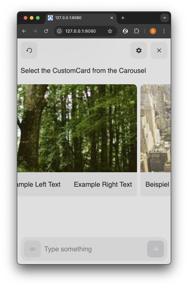
The Carousel component provides a horizontally scrollable container for displaying multiple cards or items. It's designed to work seamlessly with CustomCard components to create interactive, scrollable content galleries.
Properties
Carousel Properties
The Carousel component accepts these properties:
| Property | Type | Required | Description |
|---|---|---|---|
| children | ReactNode | Yes | Content to be rendered inside the carousel |
Import and Basic Usage
You can import the Carousel component from touchpoint once the package has been installed or made available in your project.
Define onClick
When using Carousel with CustomCard components, define click handlers on the individual cards to handle user interactions. The Carousel itself is a container component.
Access the ConversationHandler method
sendChoice via conversationHandler.sendChoice to send the user's choice back to NLX.
Read more details about building Custom Components with Touchpoint in the Getting started with Touchpoint components documentation page.
Example
The Carousel component is best used with multiple CustomCard components to create a scrollable interface.
Example Modality Schema
1[
2  {
3    "id": "uuid",
4    "thumbnail": "imageUrl",
5    "label": "Label text",
6    "value": "Value text"
7  }
8]
Example Carousel Component
1<html lang="en"> 2 <head> 3 <title>Touchpoint Sample HTML</title> 4 <meta name="viewport" content="width=device-width, initial-scale=1"> 5 </head> 6 <body> 7 <script type="module"> 8 import { create, React, html } from "https://unpkg.com/@nlxai/touchpoint-ui@1.2.4-alpha.9/lib/index.js?module"; 9 10 const ItemsCarousel = ({ data, conversationHandler }) => { 11 const [selectedItemId, setSelectedItemId] = React.useState(null); 12 13 return html`38`; 39 }; 40 41 // Register component when creating touchpoint 42 const touchpoint = await create({ 43 config: { 44 applicationUrl: "YOUR_APPLICATION_URL", 45 headers: { "nlx-api-key": "YOUR_API_KEY" }, 46 languageCode: "en-US", 47 }, 48 modalityComponents: { 49 ItemsCarouselModality: ItemsCarousel, 50 }, 51 }); 52 53 </script> 54 </body> 55</html>
Related Components
- Custom Cards for card components used within carousels
- Typography for text styling within cards
- Icons for visual elements in cards