Custom Components
DateInput
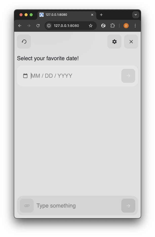
Date Input Example
About
The Date Input component provides a user-friendly interface for entering and submitting dates in a standardized format. It combines input masking, validation, and submission capabilities in a single component.
Properties
| Property | Type | Required | Description |
|---|---|---|---|
| onSubmit | function | No | Handler function that receives the parsed date string (YYYY-MM-DD) |
Import and Basic Usage
You can import the DateInput component once the package has been installed or made available in your project.
Define onSumbit
The Date Input Component expects a function passed via
onSubmit that be called when the user finalizes their date selection.
The ConversationHandler method sendSlots is available through the
conversationHandler.sendSlots to send the user's choice back to NLX.
The
sendSlots method expects the Slot to previously be defined within NLX. For example, when the User Choice node is resolving a slot named "TouchpointDateInputResult" with the DatePicker, the SlotResponse should be {"TouchpointDateInputResult": date}.
Example
The DateInput component is best triggered in a User Choice Node on NLX with a modality attached to trigger the DateInput component. The date selection should be sent back to NLX to fill the slot in the User Choice Node and NOT as a choice. This is different than the typical CustomCard or Button components where the choice back to NLX it typically a 'choice'.
Example Modality
In the examples below, the modality is named
DateInputExample with a single string as the schema.
Example Date Input Component
1<html lang="en"> 2 <head> 3 <title>Touchpoint Sample HTML</title> 4 <meta name="viewport" content="width=device-width, initial-scale=1"> 5 </head> 6 <body> 7 <script type="module"> 8 import { create, React, html } from "https://unpkg.com/@nlxai/touchpoint-ui@1.2.4-alpha.9/lib/index.js?module"; 9 10 const DateInputExample = ({ data, conversationHandler }) => { 11 return html`16`; 17 }; 18 19 // Register component when creating touchpoint 20 const touchpoint = await create({ 21 config: { 22 applicationUrl: "YOUR_APPLICATION_URL", 23 headers: { "nlx-api-key": "YOUR_API_KEY" }, 24 languageCode: "en-US", 25 }, 26 modalityComponents: { 27 DateInputModality: DateInputExample, 28 }, 29 }); 30 31 </script> 32 </body> 33</html>