Custom Components
Custom Cards
- About
- Component Structure & Recommended Pattern
- Properties
- Import and Basic Usage
- Example
- Related Components
About
The Custom Card system provides a structured way to present information in your chat interface. The system consists of four components that work together:
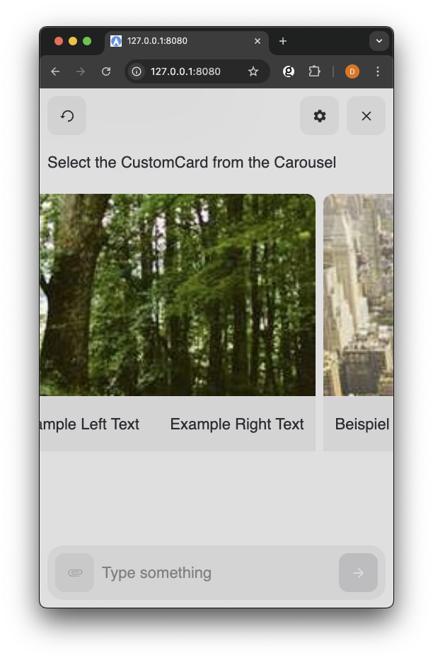
- CustomCard - Primary component, is a 'card' made up of multiple rows. A CustomCard has at least 1 of CustomCardRow or CustomCardImageRow. CustomCard can be used outside Carousel.
- CustomCardRow - Basic component for horizontal layouts within cards. Can have multiple rows in a CustomCard.
- CustomCardImageRow - Basic component for specialized image layouts within a CustomCard.
Component Structure & Recommended Pattern
The Custom Cards components follows a nested structure where components build upon each other to create rich layouts. Each CustomCard contains CustomCardRow or CustomCardImageRow components that organize the content within the card.
Recommended Card Structure:
- CustomCardImageRow at the top (optional)
- CustomCardRow elements with:
- Left side: Faded BaseText for labels
- Right side: Normal BaseText for values
- Selection state managed with React.useState
- onClick handler that updates state and sends choice to NLX
This pattern provides a consistent, professional appearance across all card-based components in your Touchpoint UI.
Properties
Each component in the CustomCard system has specific properties that control its rendering and behavior.
CustomCard Properties
| Property | Type | Required | Description |
|---|---|---|---|
| selected | boolean | No | Controls whether the card appears selected |
| onClick | function | No | Handler function for click events |
CustomCardImageRow Properties
| Property | Type | Required | Description |
|---|---|---|---|
| src | string | Yes | Source URL for the image |
| alt | string | No | Alternative text for the image |
CustomCardRow Properties
| Property | Type | Required | Description |
|---|---|---|---|
| left | ReactNode | Yes | Content to be rendered in the left section |
| right | ReactNode | Yes | Content to be rendered in the right section |
| icon | Icon | No | Optional icon component to display centrally |
Import and Basic Usage
You can import the CustomCard components from touchpoint once the package has been installed or made available in your project.
Define onClick
The CustomCard component expects a function passed via
onClick to define the actions to take when a user clicks the button.
Access the ConversationHandler method
sendChoice via conversationHandler.sendChoice to send the user's choice back to NLX to continue the conversation.
Read more details about building Custom Components with Touchpoint in the Getting started with Touchpoint components documentation page.
Example
In order to use the Carousel and CustomCard components you will need to have a modality defined in your NLX application that is a list of objects.
Example Modality Schema
1{
2  "id": "uuid",
3  "thumbnail": "imageUrl",
4  "label": "Label text",
5  "value": "Value text"
6}
Example Card Component
This defines a component
ItemCard that takes data (representing cardItemData) and an optional initialSelectedId and onSelect handler.
1<html lang="en"> 2 <head> 3 <title>Touchpoint Sample HTML</title> 4 <meta name="viewport" content="width=device-width, initial-scale=1"> 5 </head> 6 <body> 7 <script type="module"> 8 import { create, React, html } from "https://unpkg.com/@nlxai/touchpoint-ui@1.2.4-alpha.9/lib/index.js?module"; 9 10 const ItemCard = ({ data, conversationHandler }) => { 11 const [isSelected, setIsSelected] = React.useState(false); 12 13 const handleClick = () => { 14 setIsSelected(true); 15 conversationHandler.sendChoice(data.id); 16 }; 17 18 return html`29`; 30 }; 31 32 // Register component when creating touchpoint 33 const touchpoint = await create({ 34 config: { 35 applicationUrl: "YOUR_APPLICATION_URL", 36 headers: { "nlx-api-key": "YOUR_API_KEY" }, 37 languageCode: "en-US", 38 }, 39 modalityComponents: { 40 ItemCardModality: ItemCard, 41 }, 42 }); 43 44 </script> 45 </body> 46</html>
Related Components
- Typography for Typography components
- Icons for visual elements
- Theming Touchpoint